Rebirth of a Restaurant: Designing New Baroo, Part 1
An introduction to how to make tangible the spirit of baroo in our new space
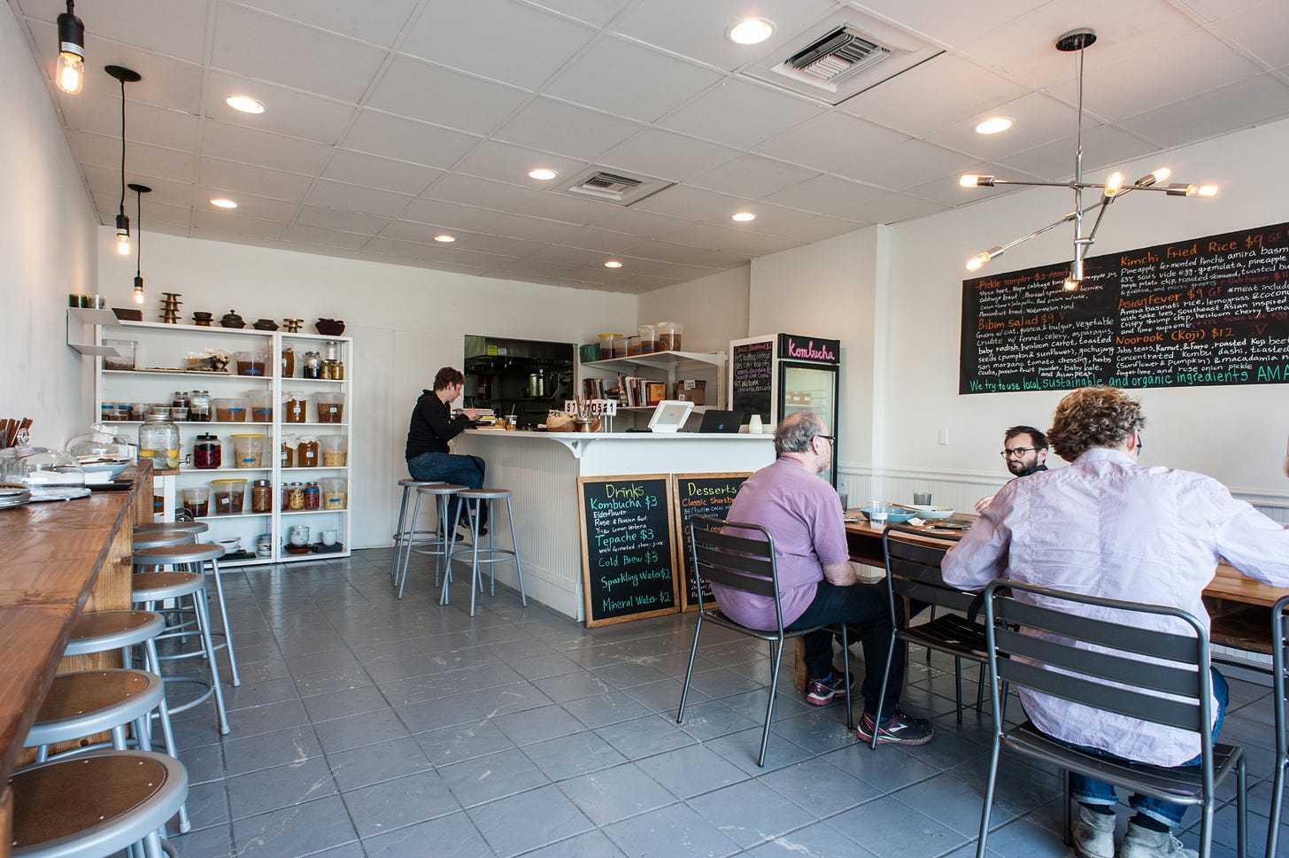
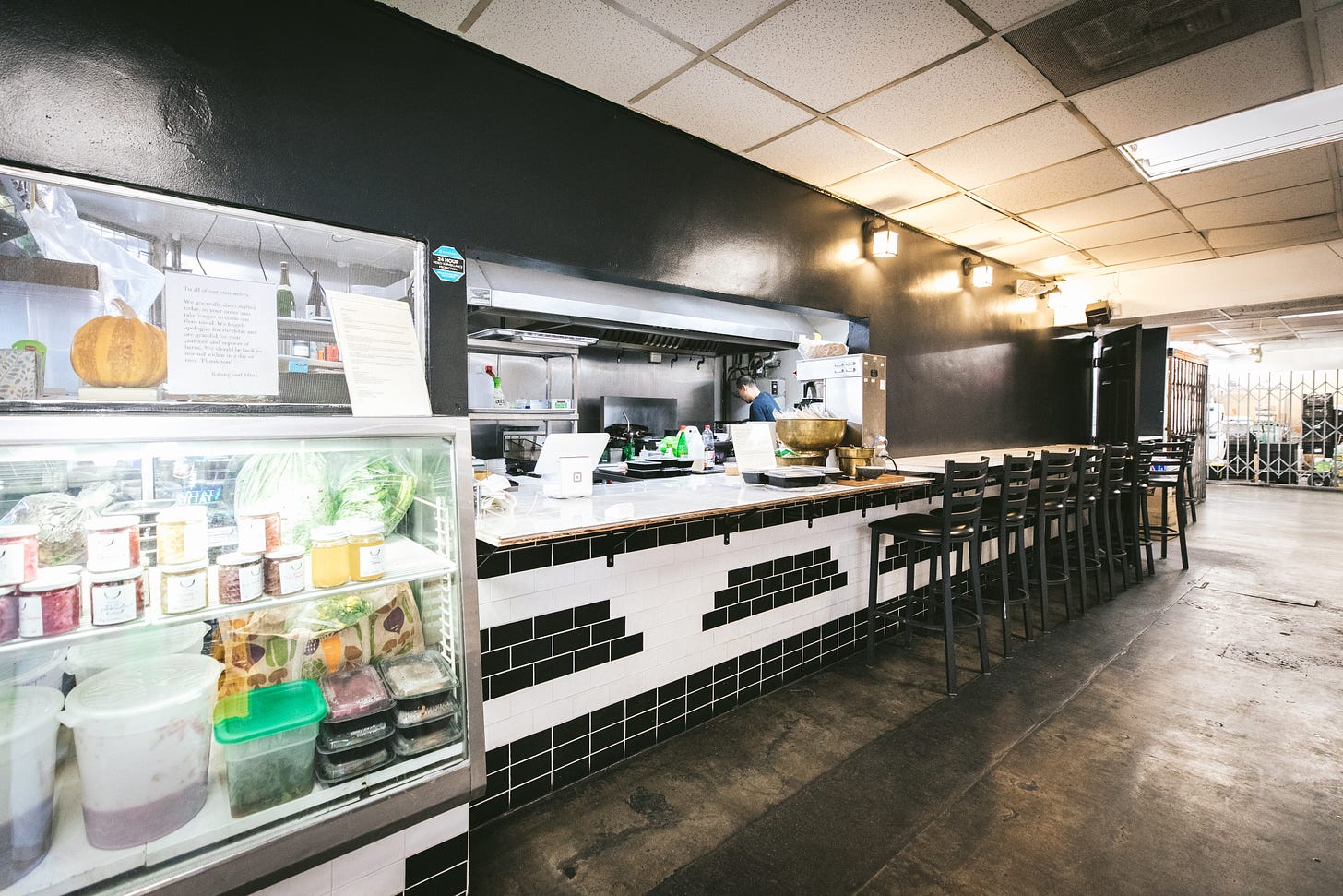
Old baroo (aka baroo 1.0 or as Kwang likes to call it these days, baroo OG) was in a former Thai noodle shop in an East Hollywood strip mall. As I’ve mentioned in past newsletters, the restaurant was furnished with a handful of Ikea stools and shelves, and Kwang and Matthew painted the floors and walls themselves. I loved that space and I think a decent number of people loved it too. For the aligned diner, it was a delight to discover Kwang’s fine dining-leaning grain bowls in what the first LA Times headline about baroo in 2015 described as a “crappy Hollywood strip mall”. I didn’t know you could say “crappy” in a newspaper headline until Amy Scattergood made it happen.
There was a frisson created by the dissonance between the environment and the food which was spirited and exciting to many, myself included. This freestyle, DGAF air to old baroo made it fun and a favourite among people who also DGAF such as a small legion of baroo supporters who are French, famous for their sans souci attitude and love of the louche. Two months after we closed baroo, a French fan from Paris named Benjamin called and left a long voicemail on my phone (which was baroo’s phone until, oh, we opened new baroo). He sweetly wished us all the best and declared that baroo was by far his favourite restaurant and hoped we would reopen soon. I still have his voicemail saved on my phone. Whenever we reopened baroo, we didn’t want to disappoint Benjamin and this group of appreciative iconoclasts who cared more about Kwang’s food than a nice chair or lighting.
At the same time, when we decided to move forward with a tasting menu concept, we wanted physical baroo to be slightly more aligned with the level of the food we wanted to share and be a place where more people would like to bring friends and family, drink Korean sool (alcohol) and stay a while. With old baroo and baroo canteen (which was our pop-up inside an East Hollywood swap meet), young Korean American guests sometimes returned with their parents to share this new, modern Korean approach to cooking. Almost always, the first generation parents seemed confused as to why their children would subject them to these bizarrely rundown surroundings and make them sit on a stool at a shared table and eat food that they would not classify as Korean. It would be nice to have a space that our parents wouldn’t mind spending time in as well. Even Kwang recognized that having a more comfortable space that felt welcoming to a wider range of guests would have made baroo more sustainable.
While I am very happy sitting on a plastic stool eating street food any day of the week and loved the entire experience of old baroo, I also have a lifelong obsession with interior design handed down from my late mother. We moved house often during my childhood, and every move was an opportunity to create a new home from the inside out. When my parents were looking for the last house my mother would live in, she and I would look at photos of potential houses and imagine what each room would look like. My mother and I spent countless hours over the years perusing furniture in showrooms and unearthing treasures at local thrift shops and flea markets. We compared paint colours and upholstery fabric samples, sometimes just for fun, and paged through piles of issues of Architectural Digest and other interior magazines together. As an adult, I moved around a bit and I still feel the thrill of setting up a new home, turning it into a warm retreat through a peaceful palette and beautiful furniture, our current home overrun with Paw Patrol trucks notwithstanding.
I’ve always been clear with myself and Kwang that my aesthetic is not the same as the baroo aesthetic. My design aesthetic is more elegant and what Kwang and I call “lovely”. Kwang’s aesthetic is, as discussed, DGAF; and as a result, as my friend, chef May Chow, summed up when she visited baroo canteen - cool without even trying to be cool which makes it even cooler. What other fine-dining-trained chef sets up in a swap meet? I’ve never been that cool and have long been okay with that.
My energy is fundamentally very different from Kwang’s energy. And I’ve always held that it is Kwang’s creative energy that should always shine through in baroo. So, our design challenge, in the parlance of the design shows I binge while cooking, was how to create an elevated space where guests felt comfortable and seemed appropriate for a (relaxed) tasting menu, but still reflected and allowed for Kwang’s freestyle spirit to be the focus. We also wanted the space to reflect Korean design elements in an organic way that didn’t feel forced and didn’t feel overly designed.
Luckily, having a smaller budget than a typical upscale restaurant encourages a quirky, unfinished quality to one’s buildout and is the deciding factor regardless of preferred aesthetics. Also luckily, we have friends in the founders of OWIU Design, Amanda Gunawan and Joel Wong, who came weekly (often several times a week) to our pop-up baroo canteen. Amanda is from Indonesia and Singapore, and Joel is from Singapore, and their design firm embodies the organic minimalism imbued by our shared Asian sensibilities, and when they offered to help us with new baroo, whenever that happened, Kwang and I agreed that it would be a blessing to work with them. More on working with OWIU in the second part of this story coming next week.
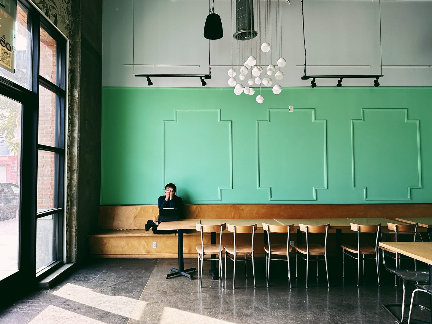
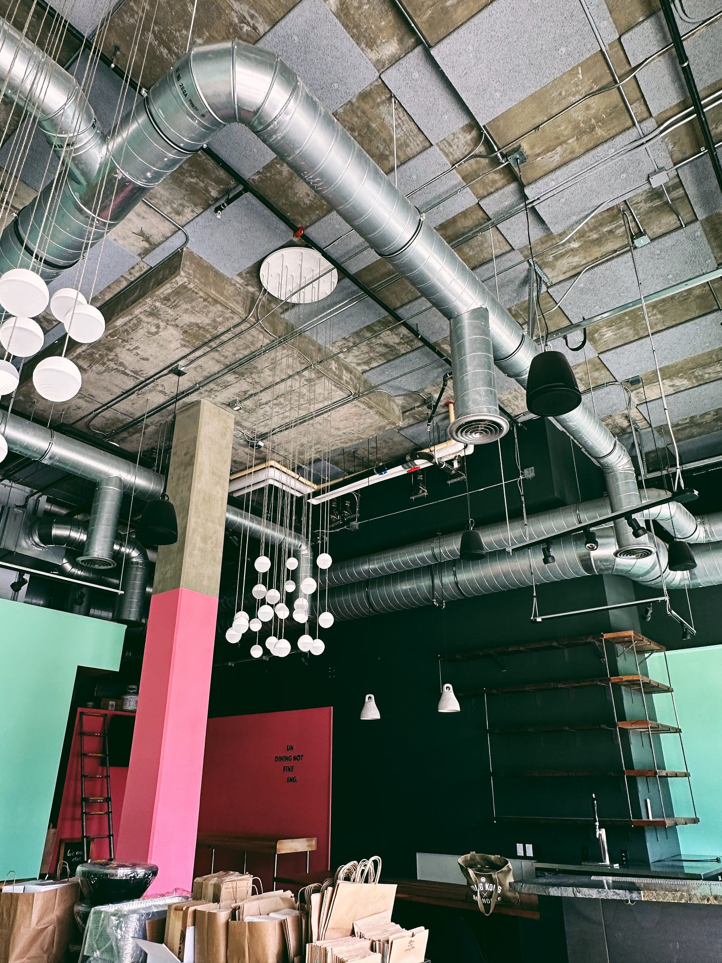
The third thing that we were fortunate to have secured was a space that was good enough. Yes, there were mint green walls with wainscoting, Pepto Bismol pink walls and pink-painted concrete columns, with a red and black hallway when we took over. Yes, there was a questionable 1980s-style chandelier in the middle of the dining room with an array of frosted globes suspended in a cascade. These types of things we could fix within our budget.
Other design elements we could not. There was (and still is) a logic-defying shape to the bar which makes storage behind the bar impossible. There is also an ugly checkerboard of acoustic panels on the double height ceiling that is both a godsend in terms of sound and a curse (aesthetically). The top third of one wall was painted charcoal grey and the facing wall painted white at top before all of the exposed electrical and HVAC were installed over it making it prohibitively costly to paint around all the tubing. The concrete floor inexplicably has two different colours with a thread of brass running across the entrance demarcating the two shades of grey. Did we have the budget to repour new floors? Not a chance.
But at its heart, our space is an industrial loft, and I love love love a good industrial loft. As I’ve mentioned before, I’ve lived in lofts in Brooklyn and Hong Kong and have a deep love for the high ceilings (who doesn’t), the iron framework on the windows, the concrete and exposed pipes of warehouse spaces. I wished we had exposed brick and more raw elements in our space, but with no key money and an existing kitchen, I am not complaining about our deal!
Next week, I'll share how we incorporated our Korean cultural touchpoints into this industrial space and, with the help of the OWIU team and our limited budget, tried to create a beautiful space that isn’t too beautiful. I know that for the die-hard baroo fan, walking into the new baroo space is still jarring in how different it is from the old hole-in-the-walls on Santa Monica Boulevard. It’s relieving to see many return multiple times since we opened. So for some, the baroo spirit is still palpable, thank goodness. And as we settle more and more into our space, I think that freestyle spirit will come through even more insistently. More on our (mostly) finished space next week.
xx mina


