Rebirth of a Restaurant: The Look of baroo
Pulling it all together with a little help from our friends, finding bargains and finding peace with our budget
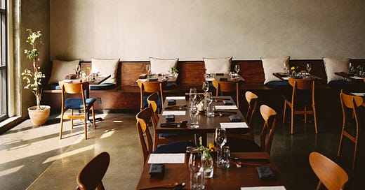
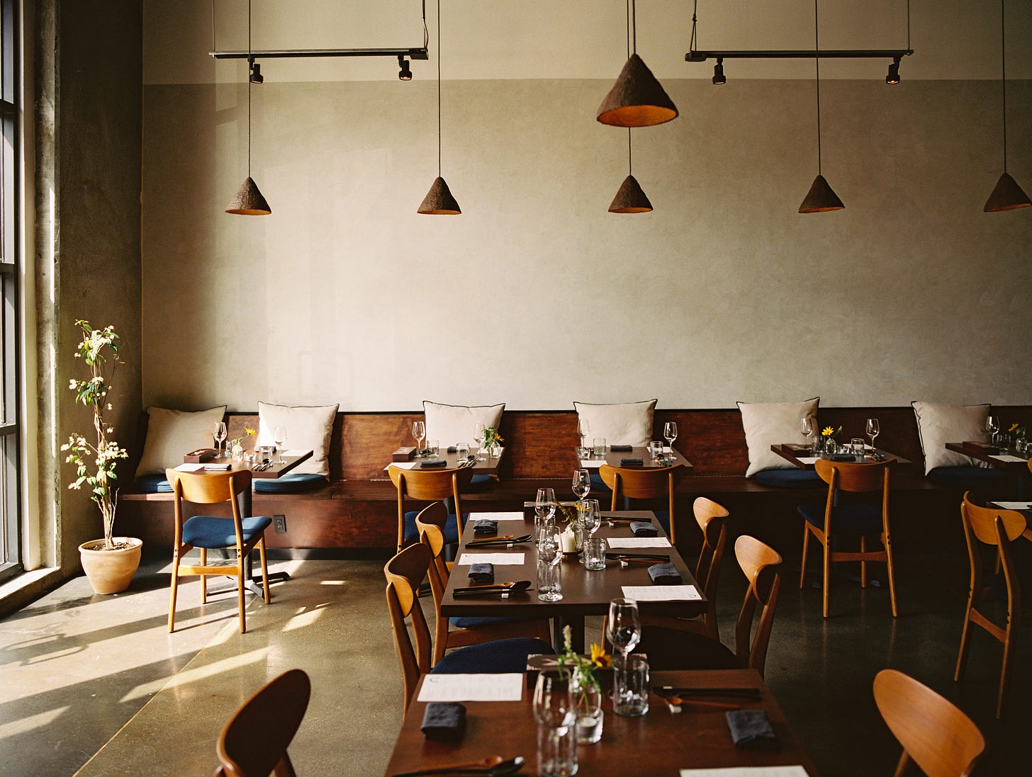
Our baroo space is now my favourite place to spend time. Which is good news since it’s the time where Kwang and I (and increasingly our son) spend almost all of our waking hours. While our home descends into neglectful chaos, our restaurant feels warm and cozy to me, elegant while also slightly unfinished, polished without being too luxurious. We wanted baroo to feel homey and didn’t want the design to have that overly designed restaurant feel that we couldn’t afford anyway. An Infatuation review described our new space as feeling like “a cool friend’s industrial loft'“. At our age, we don’t feel cool anymore, if we ever were, but Brant Cox sums up pretty succinctly what we had hoped for in terms of baroo’s design.
So how did we do it? Here is my three-step guide to pulling together the interior of a restaurant with limited funds and time:
Have uber-talented designer friends.
Feed people who happen to be talented architects and interior designers. That’s what we did unknowingly. In early 2019, we did a pop-up at the first Frieze Los Angeles art fair and, as luck would have it, a pair of art-lovers discovered our food and became weekly (sometimes it felt like daily) diners at our next pop-up, Baroo Canteen. As I mentioned in my last newsletter, hey turned out to be Amanda Gunawan and Joel Wong, founders of OWIU Design, an architectural design studio with a beautiful zen aesthetic that has done residential projects and also restaurants both in LA and Singapore. When they first offered to help us with new baroo years ago, we actually first told them that we wouldn’t be able to afford them, but Kwang & I talked wistfully with each other about how they would be perfect for baroo.
When we started focusing on actual potential spaces, we started a conversation with Amanda and Joel, who by then felt like friends and not just baroo customers. Their excitement to be part of our project, their aligned vision for baroo’s physical space, their global experience with fine dining restaurants, their willingness to help us as much as possible with our small budget were all key to us be able to realize our hope for baroo.
We asked Amanda & Joel to draw up an ideal design plan for baroo, irrespective of our budget, so we could see what the potential was for our space. The design brief was modern hanoak. Hanoaks are traditional Korean homes, with signature dark wooden beams which contrast with light-colored walls. Kwang & I love the cafes in Seoul in areas like Ikseon-dong that have turned hanoaks into quirky, fun spaces grounded in tradition and we hoped that baroo could have a similar vibe even though our industrial loft was far from a hanoak.
With the modern hanoak brief, OWIU gave us a luxurious design plan and then we just took elements of the design plan that we could afford. The OWIU team, which included Edwin & Nate running the day to day on our project, were practical and helped us focus on the key elements we needed to get right and had no experience in. Seating and table placement. Light placement.
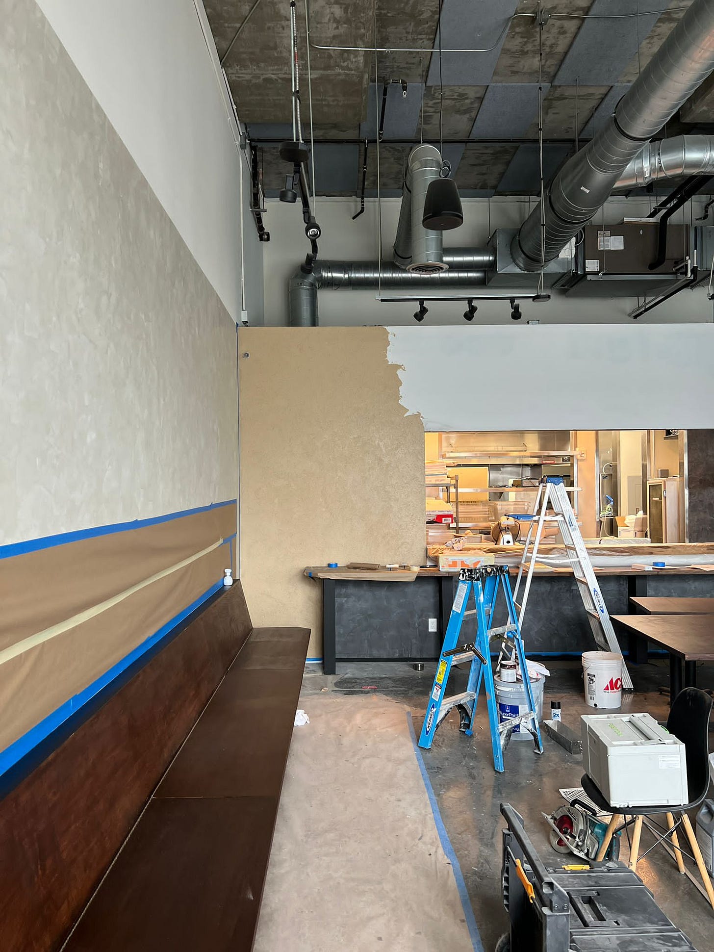
We shopped around for contractor quotes and decided to go with OWIU’s contractor team, which was the best decision we made. Because of their deep relationship, we were able to get things done much cheaper. Venetian plaster, which did not seem attainable given our budget, was possible thanks to OWIU and their contractor team. Because OWIU were so keen on trying out a Japanese plastering technique called shikkui, which involves mixing plaster with hemp fibers creating a traditional, organic texture, we were able to have a wall that further evokes traditional Korean homes which also feature a similar plaster.
OWIU suggested workarounds to deal with physical constraints of the space and financial constraints of our budget. For example, I would have loved to plaster all of our walls, all the way up to the double-height ceiling. Well, it turns out that’s insanely expensive, plus we had piping and wiring everywhere near the top that would be overly arduous and thus expensive to paint around. So they came up with a design where we plastered only up to a certain point and made it look intentional.
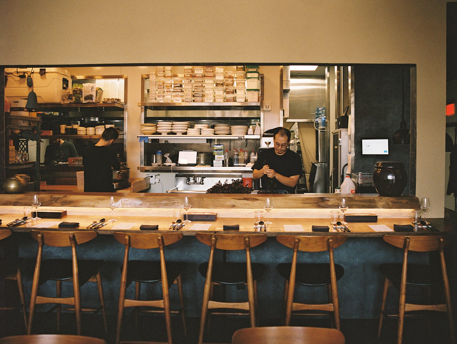
They suggested repurposing the wood from the existing bench seating to create a chef’s counter and just staining the existing maple-colored tabletops, saving us money and saving scraps from unnecessarily going to landfill. Every suggestion they made was immensely practical, thoughtful and resulted in beauty. What more could you ask for from friends! We will always be grateful to OWIU for working with us on new baroo. And thank goodness for our Karma Circulation fried chicken bowl which lured them into the baroo universe!
Have an obsession for interior design and vintage furniture hunting.
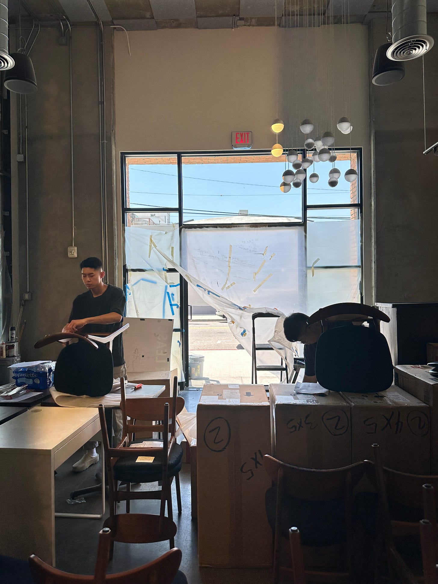
So, the original OWIU design featured custom-made wood chairs that were a bargain for a custom-made wood chair at $400 each. These chairs were designed by OWIU and they were lovely with luscious, curved arms and an organic silhouette. But we did not have a custom-made wood chair budget, full stop. What we had budget for were West Elm chairs we could purchase in bulk with an industry discount, and that’s what we have. Our pre-opening team assembled these chairs with us, and whenever I see them, I think of how many hours it took to put together 40 chairs.
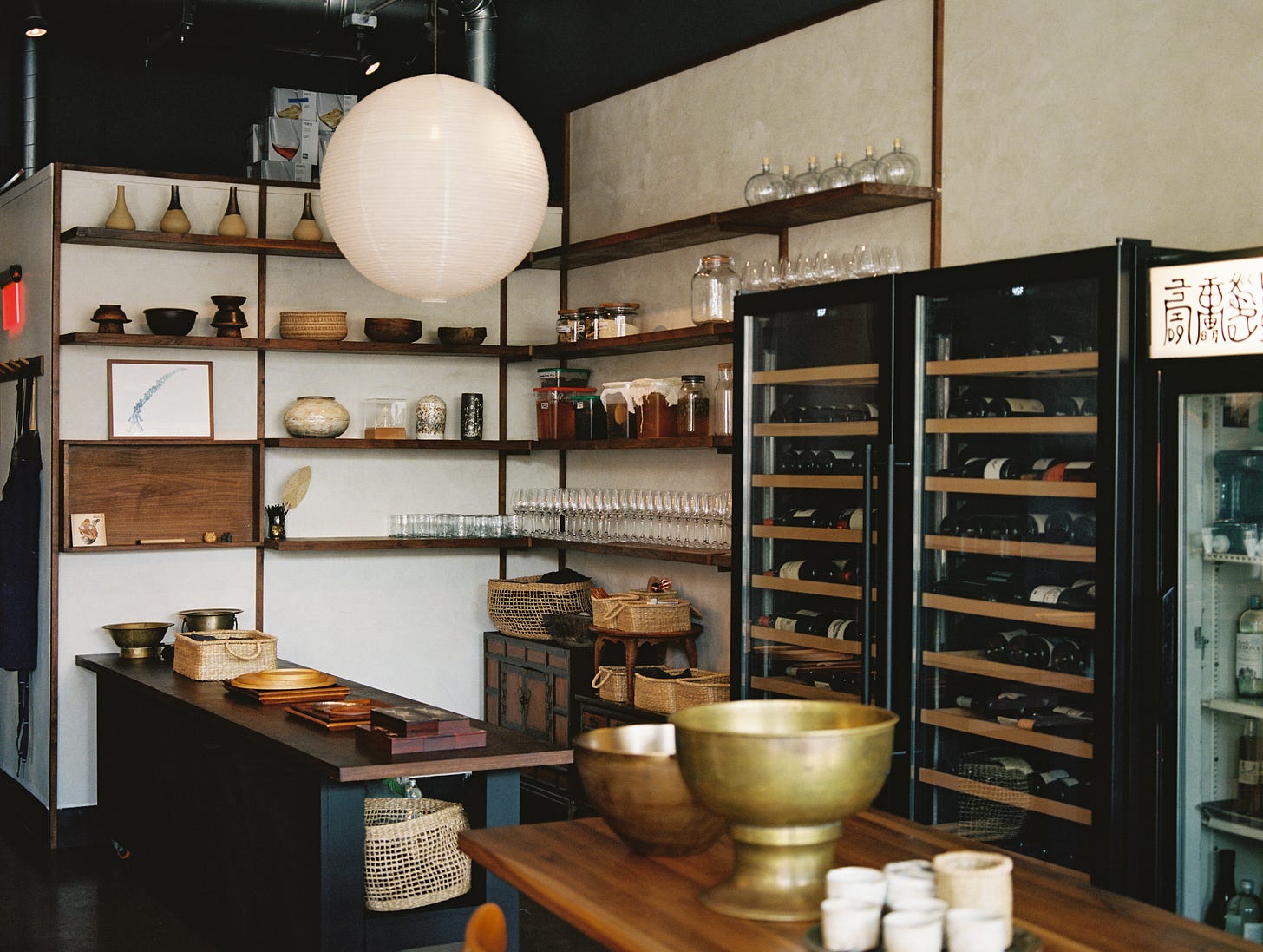
That was how I spent most of last summer. Scouring the internet for reasonably priced furniture and lighting and applying for industry accounts with online furniture stores. Literally days and weeks of scrolling through websites, trying to find things like walnut stools at the right height and price and round cushions in the right shade of navy blue for the newly stained and incredibly hard bench seating. Luckily, as I mentioned last time, I love looking at furniture and decor websites so this quickly and happily took over my life. Though even this obsessed decor-head started to feel overwhelmed searching for last-minute details like the right brass hooks for beneath the chef’s counter.
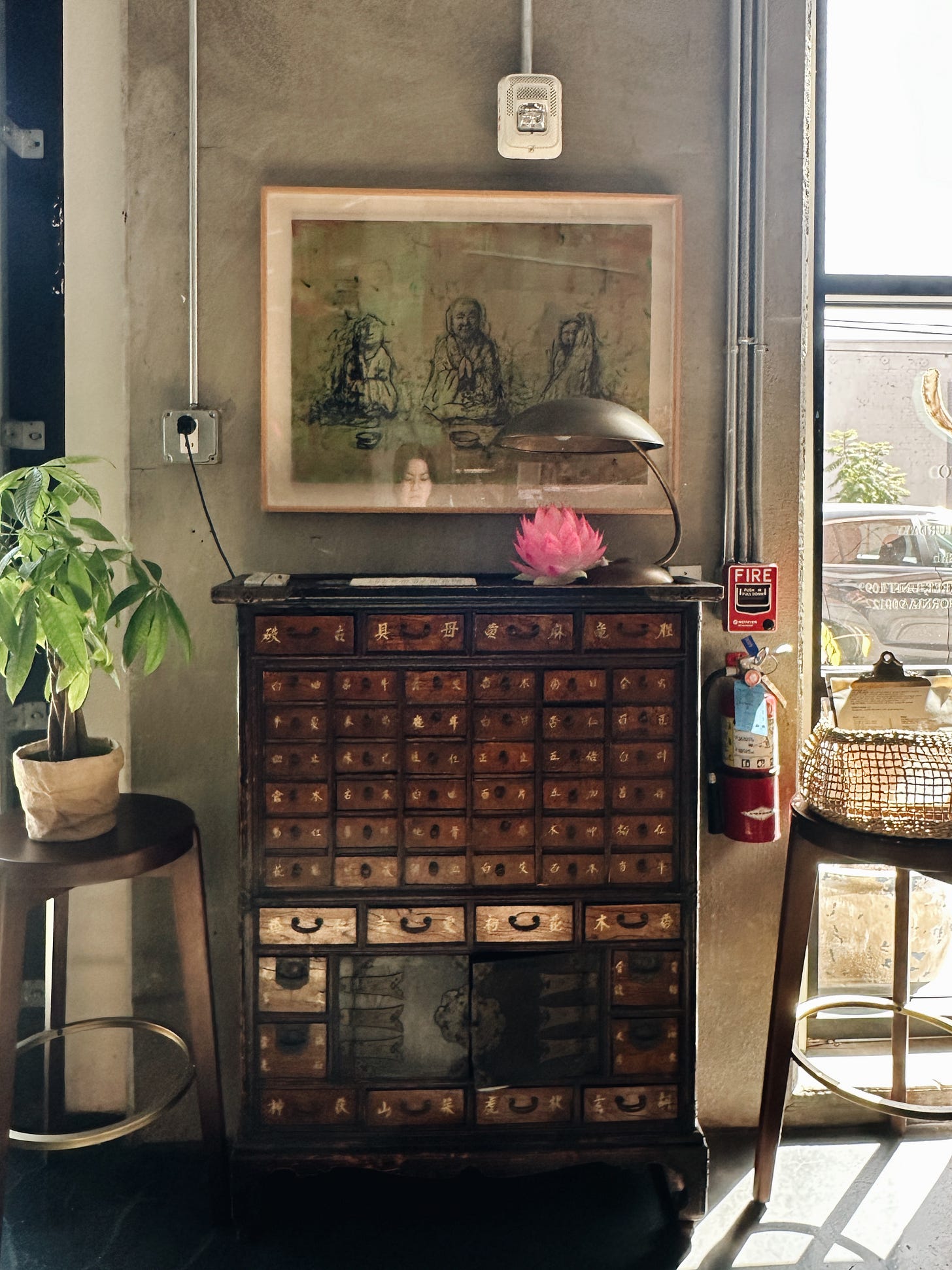
My favourite part of this time was looking for vintage and antique Korean pieces to complete the look. I brought some pieces from home, and also I found great scores like a Korean bandaji chest replica on Facebook Marketplace and a Korean apothecary chest on vintage resale sites like Chairish. My proudest find is a Korean apothecary chest on Facebook Marketplace with a Hollywood pedigree that was once owned by classic film star, Bette Davis. How Bette Davis came to have this chest is unknown, but I like to think that she loved this chest as much as I do.
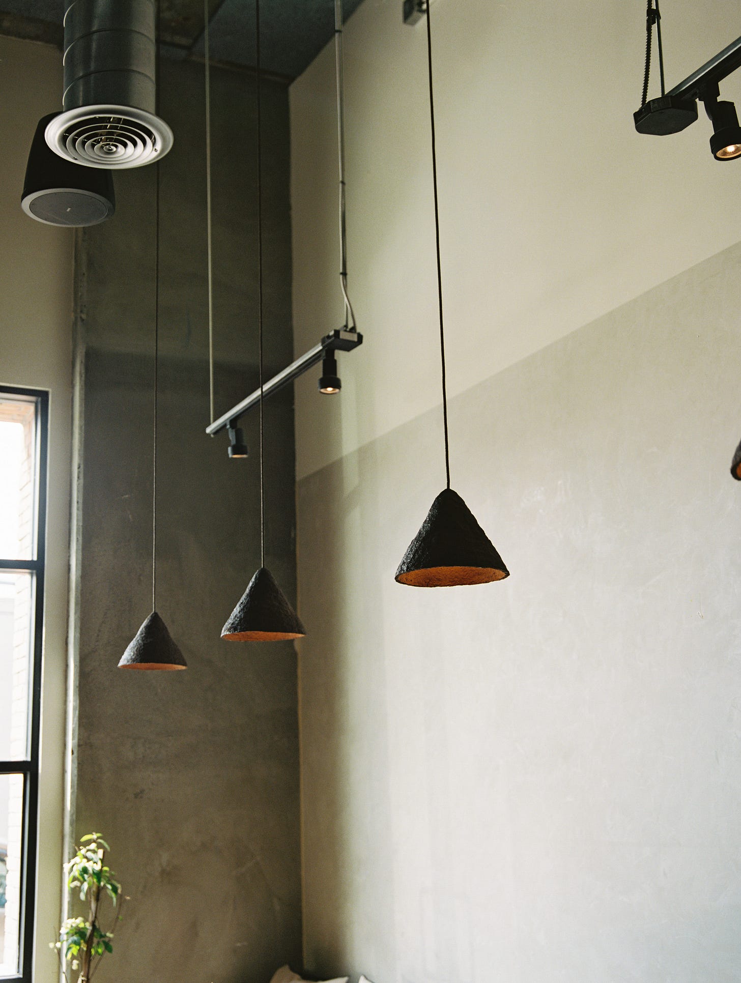
And perhaps my very favourite element of the space are our seaweed pendant lamps made by Welsh design firm, Tŷ Syml. Experimental and focused on sustainability, Tŷ Syml’s approach is very much aligned with our ideals. Plus Adam and Daniel Davies are so lovely, generous and supportive even though we’ve yet to meet in person. The lamps are made with Welsh seaweed and when I opened the box of lampshades, I could breathe in the scent of seaweed and ocean salt. Intoxicating.
Have faith.
There was a moment last summer where I looked around the baroo space and I despaired, in a deep way, with tears and something close to wailing. Dusty, torn sheets of plastic were haphazardly taped over our front windows and doors. The tape kept failing due to the dust, so every morning, I had to climb a stepladder and hang up the plastic sheets as high as my 5’3” self could manage. I was tired of the tape, the dust, the incompleteness of it all.
The walls that were only partially painted as I talked about earlier suddenly seemed to me to be too random and jarring. Why for the love of the universe did I agree to let the walls be so many different colours? The stained tables looked too cheap. Why oh why didn’t we spring for new tables? What I really did not want was a space that seemed like it was over-reaching — trying to be beautiful under a budget but only highlighting that it had been executed cheaply.
Having a partner who is completely unruffled about material concerns is important when you’re in the middle of a meltdown caused by interior design. Kwang gently helped me come to terms with the fact that my aesthetic standards were too high for our budget and I just had to get over myself. What we had was the best space we could ever hope for, thanks to the generosity of so many people like Amanda, Joel, Edwin, Johnny & Paco and the entire contractor team, Nate, Daniel, Adam and more.
There is a lot of pressure when re-opening a beloved concept like baroo, and I felt that I had jeopardized it with the new look. But Kwang reminded me of three important things: first, no one loved baroo because of its decor in the past. The food at baroo was always the reason people came and that would and should always be the case. So, frankly, it didn’t matter what the dining room looked like, ultimately. And certainly, it didn’t matter if the bathroom hallway didn’t have Venetian plaster or we didn’t have new tables. I have always had faith that Kwang’s food would be good, so I was immediately more relaxed.
Second, at night, when our seaweed lamps are dimmed, there is a glow that makes everything magical and softens all of the imperfections. Who will notice all of the details that glared out at me when I was exhausted and cranky?
And lastly, we weren’t reaching for this “ideal” restaurant aesthetic that is about perfection anyway. Baroo has thrived in its eccentricities and seeming imperfections.
Now, with or without the lights dimmed, I’m in love with our space. It was a fleeting meltdown, thank goodness. There is a warmth here that we hope matches our service and the feeling you get when we eat our food. I now feel like we have a fitting stage for what we want to do with baroo in the coming months and years, and it all seems utterly perfect to me now.
xx mina


I loved reading about the thought and intention that went behind your design! Can totally relate to partner telling me my aesthetic standards exceed my budget and to get over myself, haha. Can't wait to try Baroo on a future visit to LA.